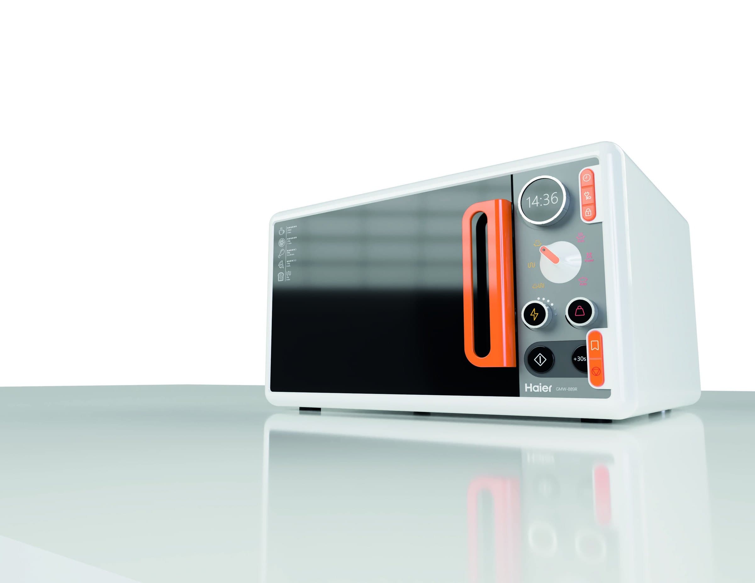
Haier microwave
Interface and style guide for a microwave oven
- Year
- 2024
- Type
- Product interface
- Context
- DIGAP TP1 — FADU/UBA
- Team
- Dante Tamaro
- Materials
- Aluminium · Plastic · Steel · Silicone · Glass
- Status
- Concept
“Colour transforms your kitchen.”
The project defines the whole identity of a kitchen appliance: the control interface, the palette, the typography, the pictograms and the materials. The orange isn't decorative — it marks where the product is touched.
Zones of operation
The panel splits into four zones, all readable from a metre away: setup, selection, adjustment and operation. Each one has its own kind of control.

Product details

- 01Side handleVertical, in the brand orange
- 02Adjustment knobsTime and intensity
- 03Built-in displayCircular, time and status
- 04Selector knobCooking mode
- 05Segmented buttonsDirect actions
- 06Rubber footSilicone, bottom support
System
The style guide defines every layer of the product, from the material to the pictogram.
Materials
- Aluminium
- Plastic
- Steel
- Silicone
- Glass
Palette
- PANTONE Bright Orange C
- PANTONE Cool Gray 1 C
- PANTONE Bright White
- PANTONE Cool Gray 10 C
Typography
- Segoe UI Semilight
- Segoe UI Bold
Pictograms
- Open door
- Set time
- Choose mode
- Choose weight and intensity
- Start cooking

Front
Process
The early explorations used colour to wrap the whole body. It was dropped: the product ended up overrun by the brand and you lost track of where it is actually operated.


Context
#JoyYouCanSee