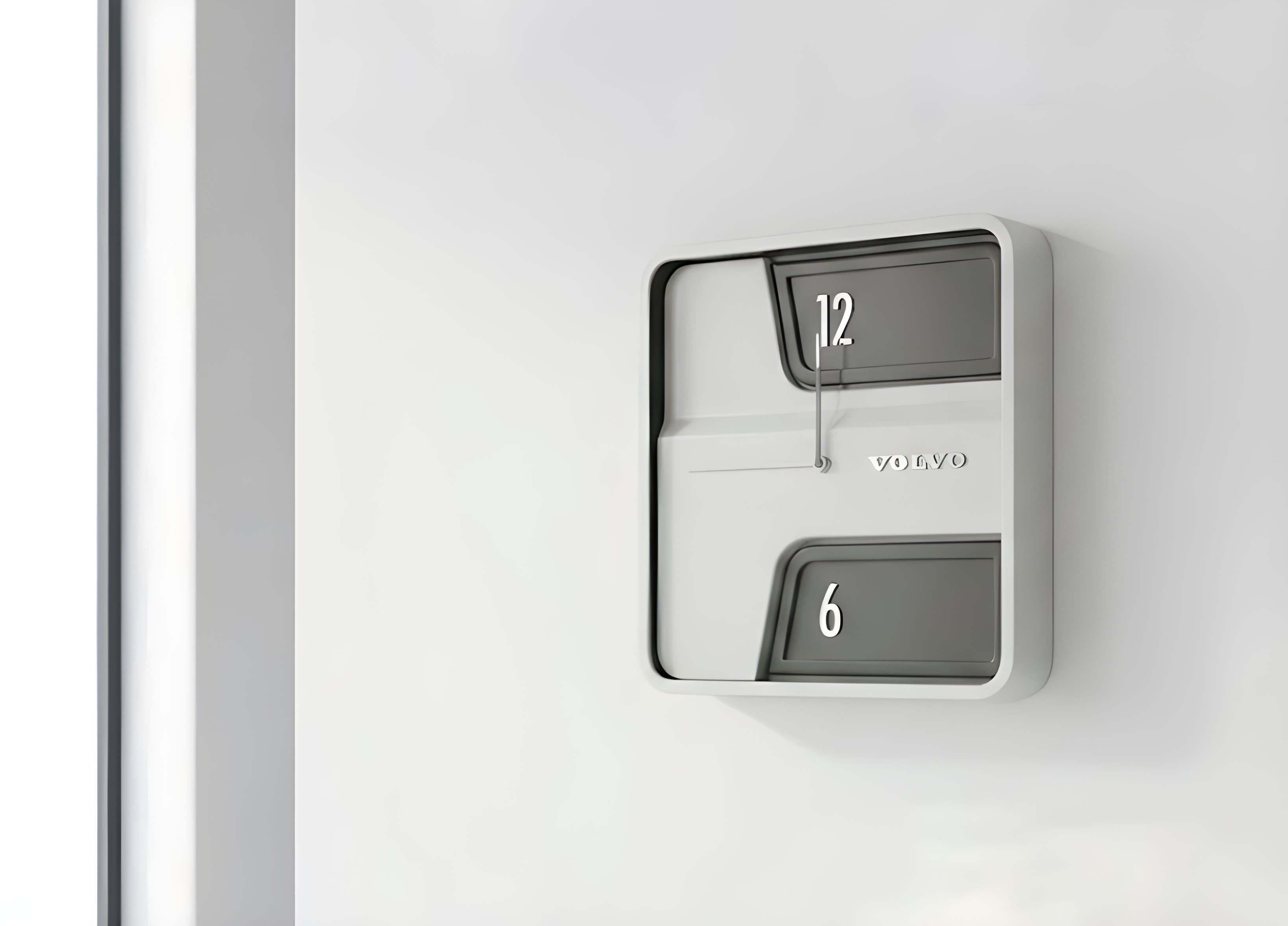
Volvo clock
Wall clock under a brand language
- Year
- 2024
- Type
- Product & interface
- Context
- DIGAP TP3 — FADU/UBA
- Team
- Dante Tamaro
- Materials
- ABS · Glass · Aluminium trim
- Status
- Prototype
Durability. The concept was approached in two ways: the aesthetic and the functional.
On the functional side, the idea that time “slows down” is what ends up producing a face where only the split between 12 and 6 stays visible. The hour divisions and the second hand are gone, and reading how time moves forward becomes deliberately harder.
On the aesthetic side, the reference was Volvo — a carmaker known worldwide for solidly built vehicles, and for the reliability and durability that come with them.
The starting point
The exercise doesn't start from a blank page: it starts from an object that already exists. A stock Dakot wall clock, full dial, twelve numbers, three hands and no brand intent whatsoever.


Two windows and nothing else
With the dial gone and only two openings left, reading the exact time costs you an extra second. That friction is the project: a clock that doesn't rush you.

Brand language
A classic typeface that carries presence and seriousness, set against the neutral colours the clock surrounds itself with.

- 01TypefaceBahnschrift
- 02ReliefWordmark debossed, no ink
- 03PaletteNeutrals: cream, blue-grey, anthracite
- 04LinesContinuous stroke, matched to the brand
Two finishes
Thickening the main structure made room for two colours and for telling the hands apart, which sharpens the focus on the hour.


Process

Physical model
The project was built physically and mounted for presentation.
This project pushed me to look past the aesthetic. What the clock gained was a concept: not settling for something that merely looks good, but trying to give it a deeper meaning.
It also forced me to work the details very carefully — with an object as simple as a clock, the goal was to build something that would hold the user's attention.